Requests
Improvement needed for look and feel Credit Card / PayPal payment choice
The current UI for choosing between Credit Card and PayPal payment looks and feels very clunky and dated - I think it needs quite a lot of improvement. In particular:
- The default "ACH" option on the menu isn't helpful or intuitive - I had to look it up in the help pages to discover that it means a bank transfer. I doubt many customers expect or actually want to use a bank transfer option anyway. I don't think it should be there by default, and at the least it should be renamed to "Bank Transfer" rather than "ACH".
- After removing the ACH option and enabling PayPal, the resulting choice has a clumsy appearance - Credit Card on the left of the window on an otherwise empty menu, and "PayPal Payments Standard" (which isn't wording that's ever seen on other websites) as a radio button on the other side.
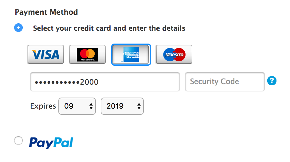
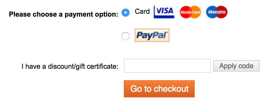
Here's how the choice looks on some other example websites - this is the type of visual choice that most people are used to seeing, I'm sure you'll agree - i.e. a simple choice (normally using a radio button) between credit card (ideally with a choice of card types) or PayPal. This gives customers some sense of familiarity, reassurance and trust when handing over their payment details. Unfortunately, the Blesta interface doesn't feel like it instills the same type of trust and I worry that my customers would be put off from handing over their details when they see it (I haven't committed to using Blesta yet - I'm still testing it out).
Apple website:

Juno Records:

Wordery book store:

Blesta:


 I like this idea
ACH is an American term unless you live there you won't know it :) I only know because Paul told me in the past but most merchants call it ACH / Wire Transfer which in the UK and most of Europe / Australia we know it as Bank Transfer.
if i'm not wrong, ACH is only working in US banks , not europe or others countries .
europe has it own system/term called SEPA .
I actually just made the switch and found out this too be rather confusing too. I am sure some customers will ask me that they don't see where to use the credit card (which we prefer over PP), costing us more fees.
What do you think of this visual credit card option? (See "After" section at https://jessepollak.github.io/card/) which is part of https://dev.blesta.com/browse/CORE-2204
The problem is that I believe we need to collect the address of the cardholder for AVS purposes. So, a visual credit card form would appear within the section that appears when you select "Credit Card" from the drop down.
However, we could display options vertically with a radio button similar to the Apple or Juno examples in this request, and perhaps request the information on the subsequent screen, or display the form within the page once selected.
I assume one big draw to this method is that the gateway's logo is displayed next to the radio option. There are some challenges with this because the gateways are essentially modules and would be responsible for displaying the logo. So, some changes would likely be necessary to the gateway system, but something we are willing to consider.
Hi Paul - thanks for the update, and I like that UI. I haven't actually seen something exactly like it before, i.e. an image of a virtual credit card that sort of gets 'created' with the numbers and card brand logo as you type, but to me it feels modern/fresh and pretty slick, and I like it.
I strongly feel that radio buttons are the right way to go, rather than a drop down - because the choices are then plainly and immediately visible to the user on the page, rather than being hidden away until they click the drop down to reveal the choices.
As to the choice of whether to request the information on a subsequent page vs. inline on the existing page after choosing the desired radio button option, I'd prefer to display it on the existing page, as that way it's quicker and easier for the user - but I don't have a strong preference on that - I don't think it would be a big deal if a new page had to be loaded.
And yes, I do think that gateway logos alongside the radio button choices are desirable, as per the examples I gave - as this is what people are generally familiar with seeing, and therefore helps to create trust.
Completely agree. The current payment types disconnect needs to be fixed. It should be simply integrated. Should be a bullet point or drop down. I like Paul example to but must address Paypal.
Any news about this request?
Comments have been locked on this page!